Learner Analytics
Providing students with deeper insights into their education

Learner Analytics
Providing students with deeper insights into their education
Learner Analytics
Providing students with deeper insights into their education
Learner Analytics
Providing students with deeper insights into their education
The aim of this project was to build a new desktop dashboard, using data and AI to provide learners with deeper insights on their time and performance. As lead designer, I was responsible for delivering an end-to-end process which involved research, design & hand-off to development
Company
CENTURY
Duration
3 months
Role
Lead Designer
The problem
The product had an existing desktop dashboard that displayed data at course level for learners, but lacked a level above which provided an overview across the whole app and insights in how learners were engaging.

To ensure we could improve our dashboard experience, we analysed the platform's existing dashboard internally and using feedback to understand what areas we needed to focus on improving. Based on this, we identified these areas to help guide us in building a successful new overview dashboard:
More Usage Data
Provide more holistic data in relation the student's time and performance across their subjects
Smart Dashbord
Integrate the app's AI-based recommendations into the dashboard
Rounded Experience
Improve links to other features to create a more rounded experience across the app
The problem
The product had an existing desktop dashboard that displayed data at course level for learners, but lacked a level above which provided an overview across the whole app and insights in how learners were engaging.
To ensure we could improve our dashboard experience, we analysed the platform's existing dashboard internally and using feedback to understand what areas we needed to focus on improving. Based on this, we identified these areas to help guide us in building a successful new overview dashboard:
More Usage Data
Provide more holistic data in relation the student's time and performance across their subjects
Smart Dashbord
Integrate the app's AI-based recommendations into the dashboard
Rounded Experience
Improve links to other features to create a more rounded experience across the app
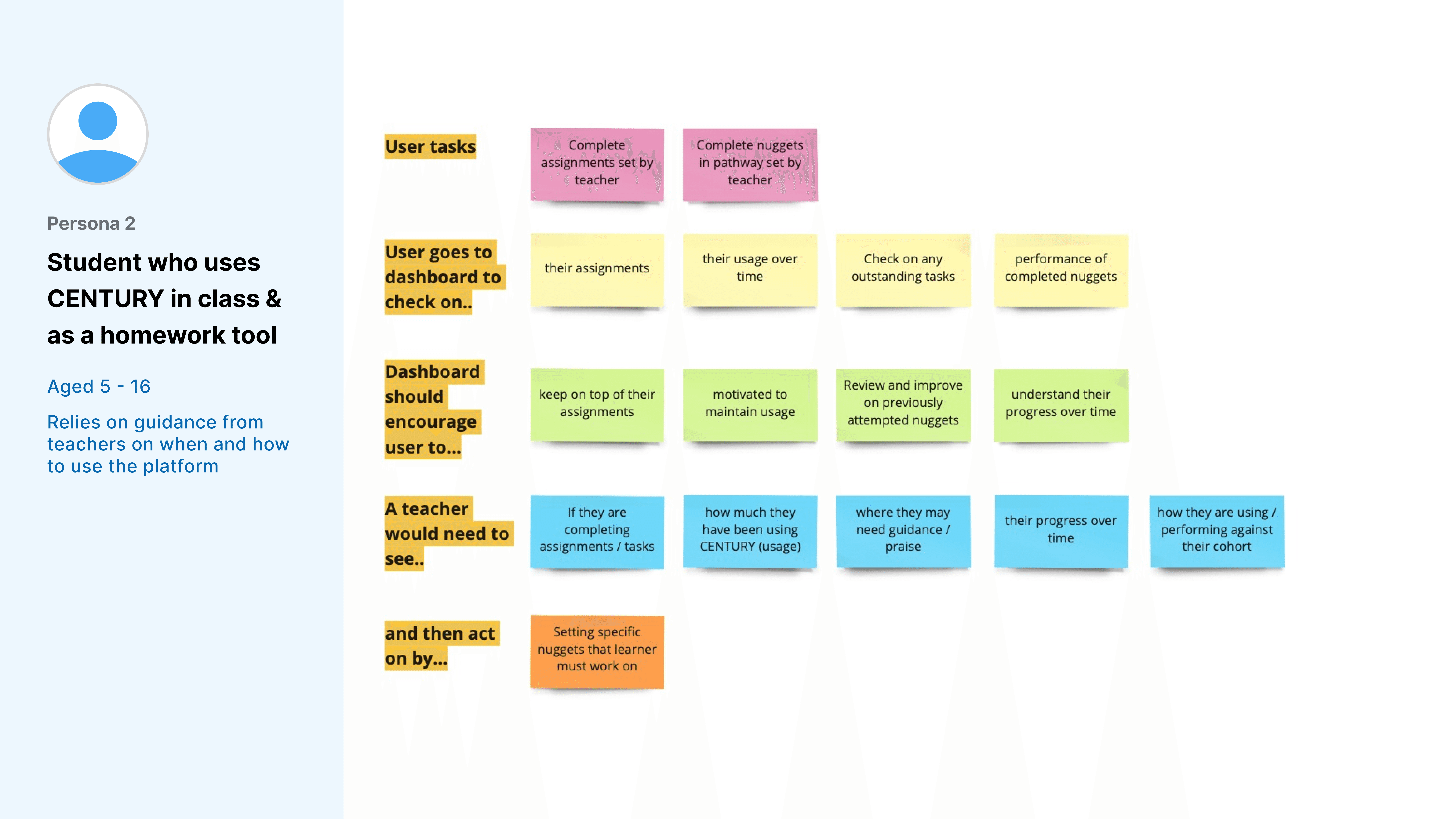
User research
I set up a remote online workshop with key stakeholders who regularly engaged with our end users. We used the session to identify and map out different types of users to understanding their specific needs. This led to a 2 main personas who we could refer to as we progressed through the project.

Explore then refine
I carried out brainstorming sessions to come up with a wide range of ideas. This involved working with engineers (backend & data) to understand what data points were available and whilst also researching existing solutions to help generate ideas.

The next step was to refine the ideas - I worked with stakeholders to map them against the problems we were trying to solve and the user needs we had defined earlier in the process. Using a simple matrix to organise the ideas, we then discussed and prioritised what ideas we felt would achieve our goal best in the time available for the first iteration. This allowed us to define each idea each further, with requirements and user stories

User research
I set up a remote online workshop with key stakeholders who regularly engaged with our end users. We used the session to identify and map out different types of users to understanding their specific needs. This led to a 2 main personas who we could refer to as we progressed through the project.
Explore then refine
I carried out brainstorming sessions to come up with a wide range of ideas. This involved working with engineers (backend & data) to understand what data points were available and whilst also researching existing solutions to help generate ideas.
The next step was to refine the ideas - I worked with stakeholders to map them against the problems we were trying to solve and the user needs we had defined earlier in the process. Using a simple matrix to organise the ideas, we then discussed and prioritised what ideas we felt would achieve our goal best in the time available for the first iteration. This allowed us to define each idea each further, with requirements and user stories
Wireframing
Connect to Content
Add layers or components to make infinite auto-playing slideshows.
I began the design phase with mid-fidelity wireframes at component level. This allowed me to explore each idea quickly, focusing more on the functionality. I organised sessions with key stakeholders to get feedback and validation, particularly from tech.
After aligning the team on a direction, I moved into visual exploration, focusing on the interaction with UI elements and design patterns through hi-fi designs. I would present my solutions to the team to explain my reasons behind each design and get feedback where necessary.

Once in a good position, I put the components together on our interface using a grid layout, placing them in a logical order for the user. This put us in a good position to test our designs with users
Wireframing
Connect to Content
Add layers or components to make infinite auto-playing slideshows.
I began the design phase with mid-fidelity wireframes at component level. This allowed me to explore each idea quickly, focusing more on the functionality. I organised sessions with key stakeholders to get feedback and validation, particularly from tech.
After aligning the team on a direction, I moved into visual exploration, focusing on the interaction with UI elements and design patterns through hi-fi designs. I would present my solutions to the team to explain my reasons behind each design and get feedback where necessary.
Once in a good position, I put the components together on our interface using a grid layout, placing them in a logical order for the user. This put us in a good position to test our designs with users
Usability testing
We tested the dashboard with a group of learners in remote testing sessions using hi-fi designs. The main goal was to get insights into how users interpreted the information being displayed. I would tag comments or observations with categories to make synthesising the data easier.

Although the tests validated a lot of the work & initial assumptions, it gave us an opportunity to iterate and improve the dashboard based on the insights discovered. After synthesis, we discussed the results as a team where I took the opportunity to work key feedback into the designs.

Feedback suggested that users found the layout frustrating for understanding when they completed their lessons (far left). Through exploration, I found a solution (far right) which grouped the relevant information together in a more practical and consistent layout
Usability testing
We tested the dashboard with a group of learners in remote testing sessions using hi-fi designs. The main goal was to get insights into how users interpreted the information being displayed. I would tag comments or observations with categories to make synthesising the data easier.
Although the tests validated a lot of the work & initial assumptions, it gave us an opportunity to iterate and improve the dashboard based on the insights discovered. After synthesis, we discussed the results as a team where I took the opportunity to work key feedback into the designs.
Feedback suggested that users found the layout frustrating for understanding when they completed their lessons (far left). Through exploration, I found a solution (far right) which grouped the relevant information together in a more practical and consistent layout
The result
A dynamic dashboard that not only lets users visually explore an overview of their performance & usage but also connects to other features & provides cognitive messaging & recommendations in keeping with the product's core AI system.

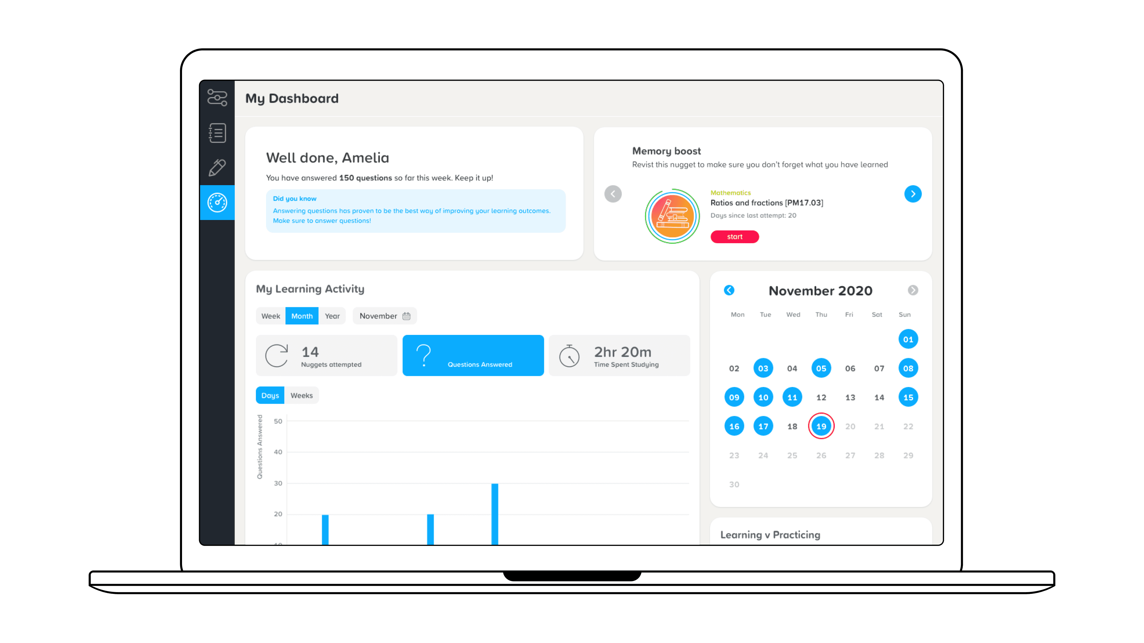
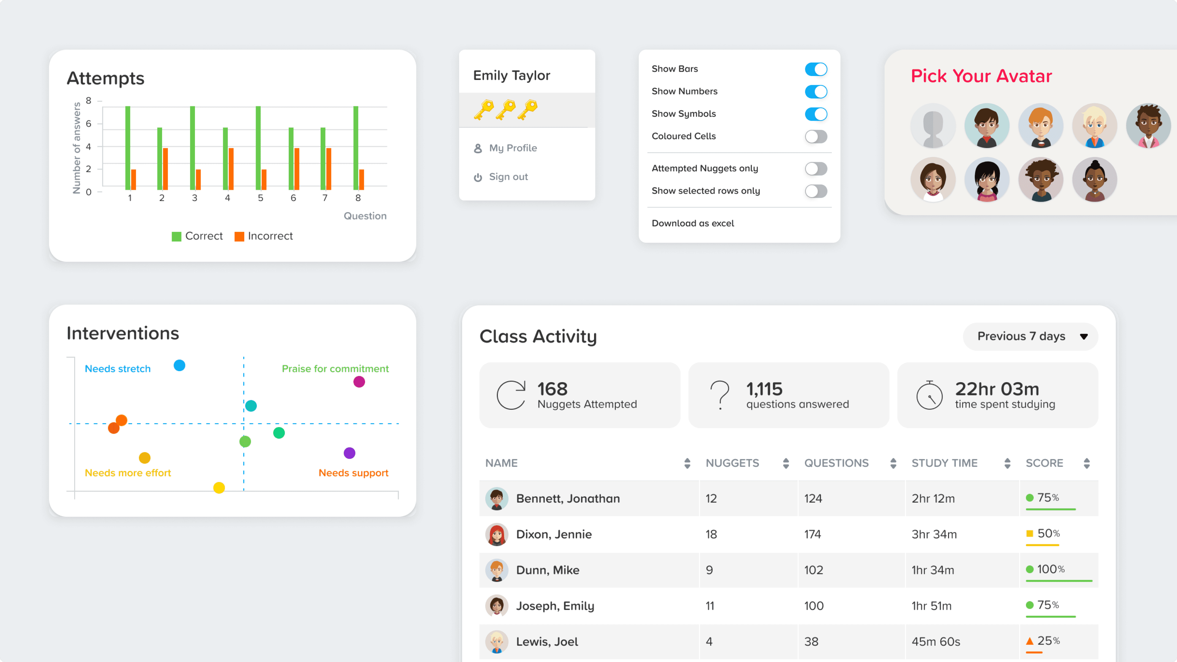
Welcome
Displays any upcoming or overdue assignments or cognitive messages that reinforce learning methods based on the user's performance

Recently completed
Shows users their 5 most recent attempts at a lesson, with high-level metrics on performance. User can click on this to bring up a detailed breakdown of their performance for the lesson

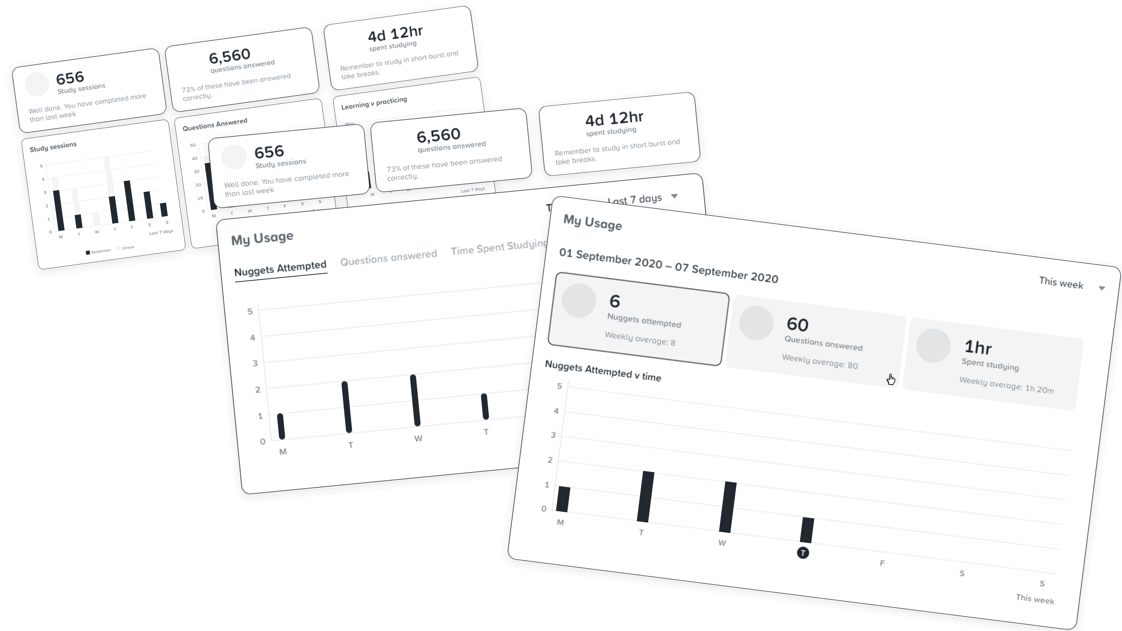
My usage
Users can view their interaction with the app over different time periods, based on their preference to help track their usage and understand their own behaviour
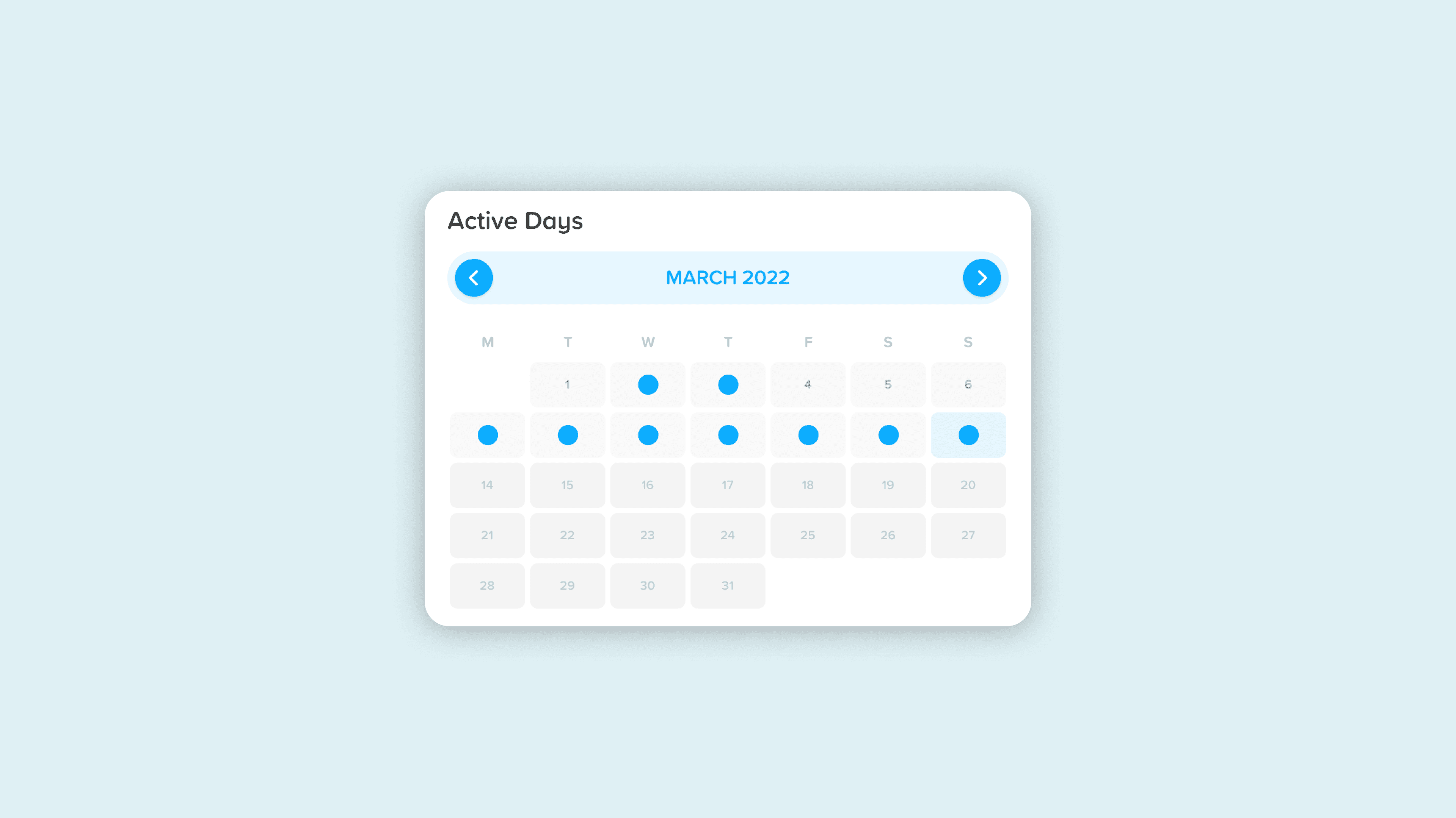
Active Days
Using gamification, this widget simply displays a dot when the user has been active that day on the platform. It encourages streak-like behaviour whilst also identifying missing days quickly
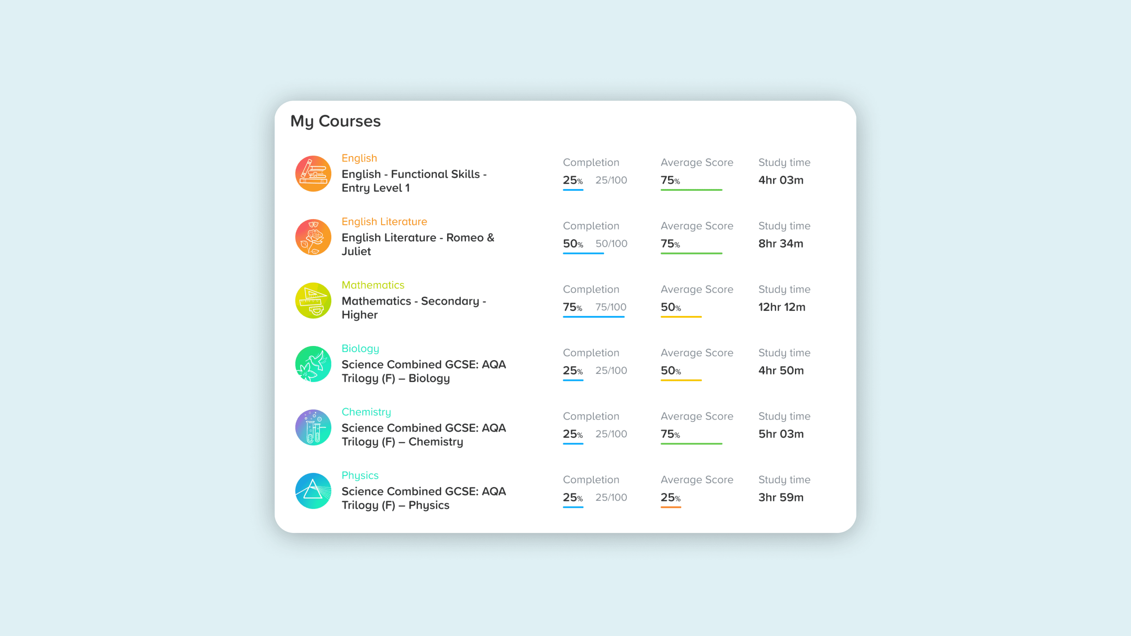
My Courses
Provides users with an overview of their performance in their assigned courses whilst also acting as navigation through to that dashboard

Next recommendation
This displays the next lesson in the product's RLP (recommended learning pathway), giving the user focus and clarity on what they should study next
The result
A dynamic dashboard that not only lets users visually explore an overview of their performance & usage but also connects to other features & provides cognitive messaging & recommendations in keeping with the product's core AI system.
Welcome
Displays any upcoming or overdue assignments or cognitive messages that reinforce learning methods based on the user's performance
Recently completed
Shows users their 5 most recent attempts at a lesson, with high-level metrics on performance. User can click on this to bring up a detailed breakdown of their performance for the lesson
My usage
Users can view their interaction with the app over different time periods, based on their preference to help track their usage and understand their own behaviour
Active Days
Using gamification, this widget simply displays a dot when the user has been active that day on the platform. It encourages streak-like behaviour whilst also identifying missing days quickly
My Courses
Provides users with an overview of their performance in their assigned courses whilst also acting as navigation through to that dashboard
Next recommendation
This displays the next lesson in the product's RLP (recommended learning pathway), giving the user focus and clarity on what they should study next
Hand-off & post release
I used Sketch to hand-off the designs to developers, which includes annotations and guidance for interaction & behaviour. Our team had a strong QA process where I would be involved to ensure components were built as intended
As part of development, we used Mixpanel to capture events from users so that we could track the success of the project and use data to inform our decisions in future iterations.
Initial feedback from schools was hugely positive with both students and teachers saying the new data gives them much better insights in how they are using the platform


Want to have a chat?
© Copyright 2023. All rights Reserved.
Made by Jonny Palmer in Framer
Want to have a chat?
© Copyright 2023. All rights Reserved.
Made by Jonny Palmer in Framer
Want to have a chat?
© Copyright 2023. All rights Reserved.
Made by Jonny Palmer in Framer
Want to have a chat?
© Copyright 2023. All rights Reserved.
Made by Jonny Palmer in Framer
The problem
To ensure we could improve our dashboard experience, we analysed the platform's existing dashboard internally and using feedback to understand what areas we needed to focus on improving. Based on this, we identified these areas to help guide us in building a successful new overview dashboard:
Our areas to focus on:
More Usage Data
Provide more holistic data in relation the student's time and performance across their subjects
Smart Dashbord
Integrate the app's AI-based recommendations into the dashboard
Rounded Experience
Improve links to other features to create a more rounded experience across the app
The product had an existing desktop dashboard that displayed data at course level for learners, but lacked a level above which provided an overview across the whole app and insights in how learners were engaging.
Usability testing
We tested the dashboard with a group of learners in remote testing sessions using hi-fi designs. The main goal was to get insights into how users interpreted the information being displayed. I would tag comments or observations with categories to make synthesising the data easier.
Although the tests validated a lot of the work & initial assumptions, it gave us an opportunity to iterate and improve the dashboard based on the insights discovered. After synthesis, we discussed the results as a team where I took the opportunity to work key feedback into the designs.
Feedback suggested that users found the layout frustrating for understanding when they completed their lessons (far left). Through exploration, I found a solution (far right) which grouped the relevant information together in a more practical and consistent layout
The result
A dynamic dashboard that not only lets users visually explore an overview of their performance & usage but also connects to other features & provides cognitive messaging & recommendations in keeping with the product's core AI system.
Welcome
Displays any upcoming or overdue assignments or cognitive messages that reinforce learning methods based on the user's performance
Recently completed
Shows users their 5 most recent attempts at a lesson, with high-level metrics on performance. User can click on this to bring up a detailed breakdown of their performance for the lesson
My usage
Users can view their interaction with the app over different time periods, based on their preference to help track their usage and understand their own behaviour
Active Days
Using gamification, this widget simply displays a dot when the user has been active that day on the platform. It encourages streak-like behaviour whilst also identifying missing days quickly
My Courses
Provides users with an overview of their performance in their assigned courses whilst also acting as navigation through to that dashboard
Next recommendation
This displays the next lesson in the product's RLP (recommended learning pathway), giving the user focus and clarity on what they should study next