CENTURY's Design System
A powerful dynamic system to power an learning platform
CENTURY's Design System
A powerful dynamic system to power an learning platform
CENTURY's Design System
A powerful dynamic system to power an learning platform
CENTURY's Design System
A powerful dynamic system to power an learning platform
As part of the team's migration from Sketch to Figma, our goal was to create a dynamic design system that aligned with our codebase. As lead designer, I was responsible for researching, building & maintaining the system along with implementing Figma as a tool into our workflow
Company
Kraken Tech
Duration
2 months
Role
Design Lead
The problem
At the time, our design team was using a small UI library in Sketch for any design work which caused the following problems:
Few UI elements meant that designers had to spend a lot of time creating components ad hoc for hi-fidelity designs or hand-offs.
Lack of structure made the library difficult to update, meaning we were often using out of date styles & components
No alignment with the codebase which cause consistency and communication issues with the team & developers
Based on this, we wanted a new design system to empower the team to:
Design with efficiency
Have access to a huge selection of components and styles to quickly & accurately put together designs for exploration or hand-off
Align with development
Use a system that is based off the codebase to create consistency throughout the tech team
Collaborate as a discipline
The system should be easy to adopt and contribute to as a designer, allowing shared responsibility to more opportunity for growth
Research & planning
I researched the different design system structures that have been established and how other companies utilised them. These examples gave good learnings & insights that could take into consideration when mapping out our own.

Research & planning
I researched the different design system structures that have been established and how other companies utilised them. These examples gave good learnings & insights that could take into consideration when mapping out our own.
Research & planning
I researched the different design system structures that have been established and how other companies utilised them. These examples gave good learnings & insights that could take into consideration when mapping out our own.
Research & planning
I researched the different design system structures that have been established and how other companies utilised them. These examples gave good learnings & insights that could take into consideration when mapping out our own.
Planning
Following on from initial discovery, I worked with our technical designer to document and analyse our existing components and structure which sat in Storybook. This gave us an understanding of how we could adapt & transform our current system into a new model.
Using this and the knowledge discovered on existing design systems, we came up a with structure that we felt would achieve our goals.
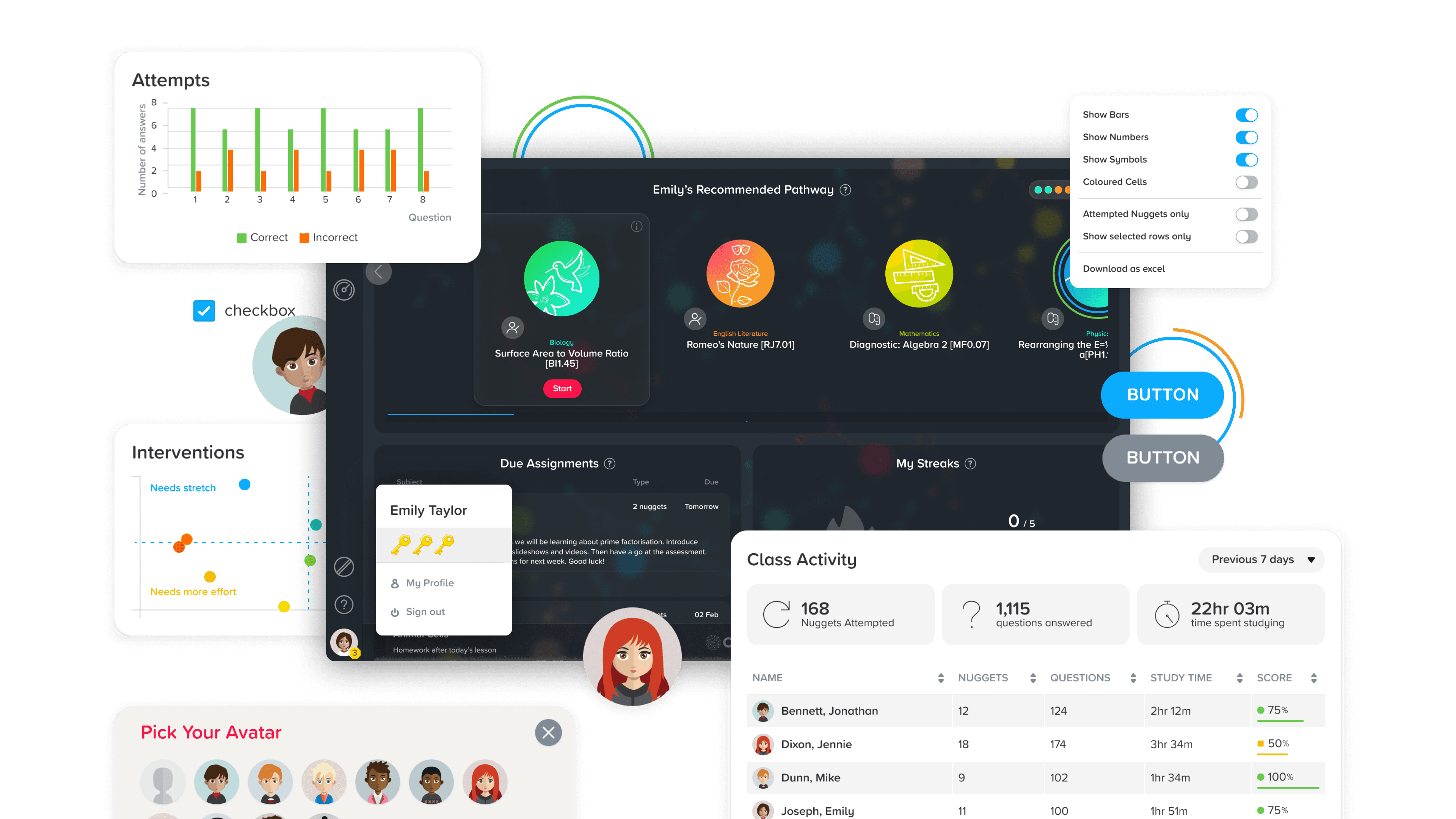
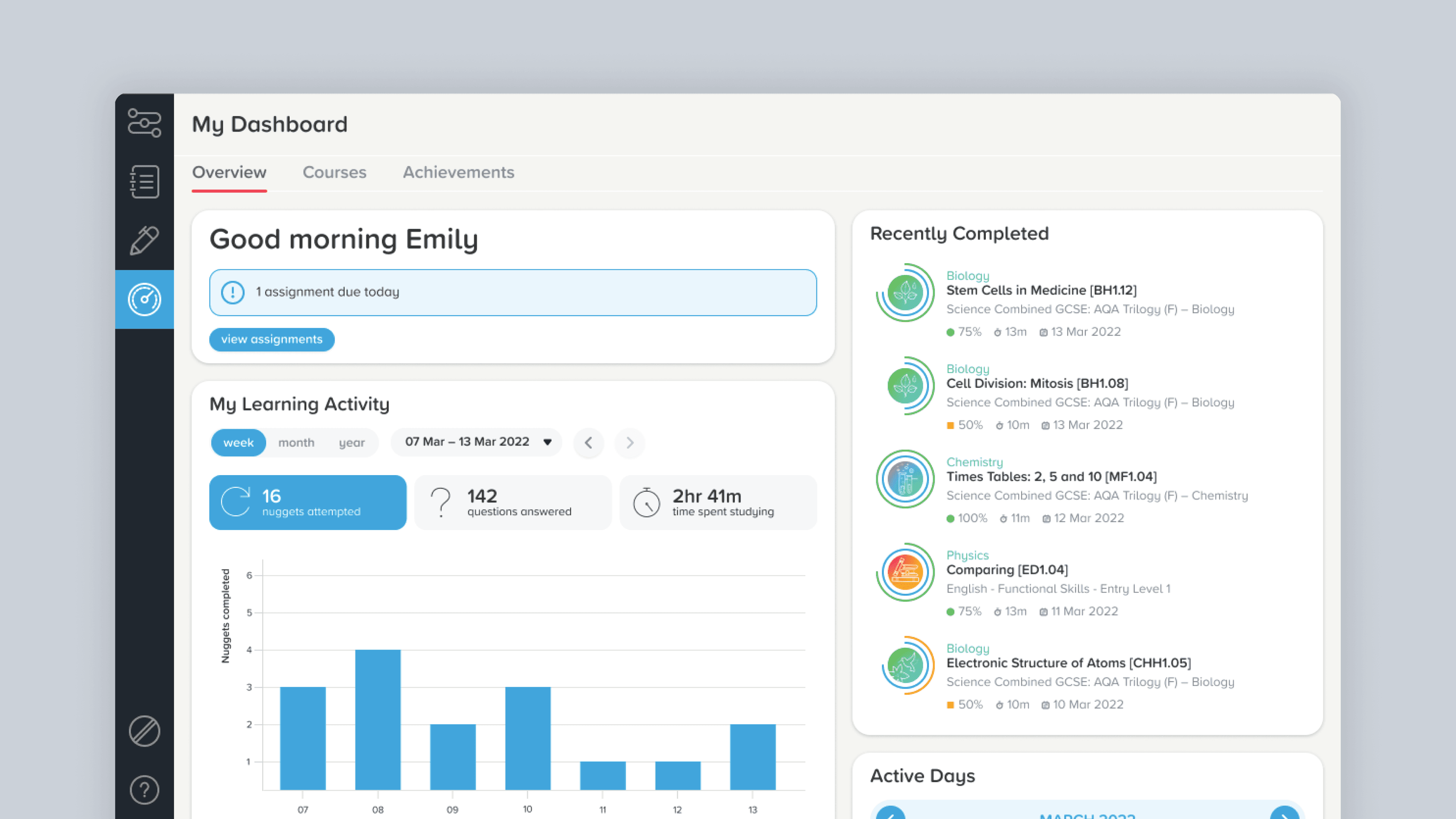
The result

I created 4 dynamic Figma libraries that systematically powered each other whilst acting as a single course of truth for designs. The vast range of components available allowed designers to explore and push solutions more quickly whilst the alignment to our development team led to better communication, hand-offs, maintenance and growth.

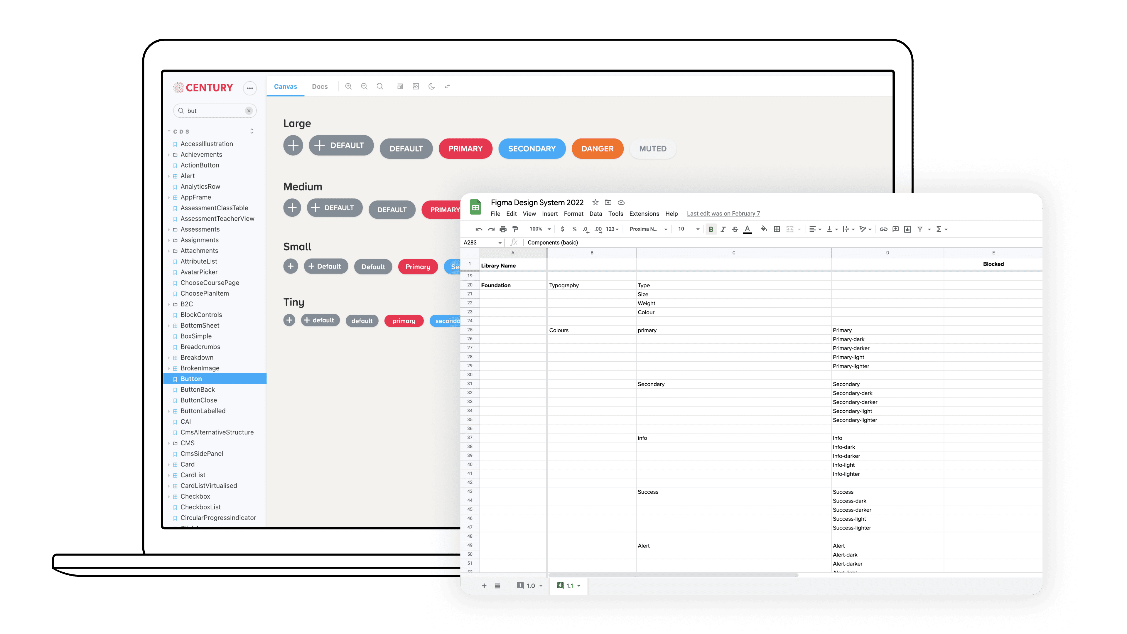
Foundation
This library acted as the baseline containing the core styles and variables that would be used throughout the other systems, including the likes of; colours, typography, icons, shadows, grids, border radius etc. This gave the team a centralised place to organise and maintain these styles
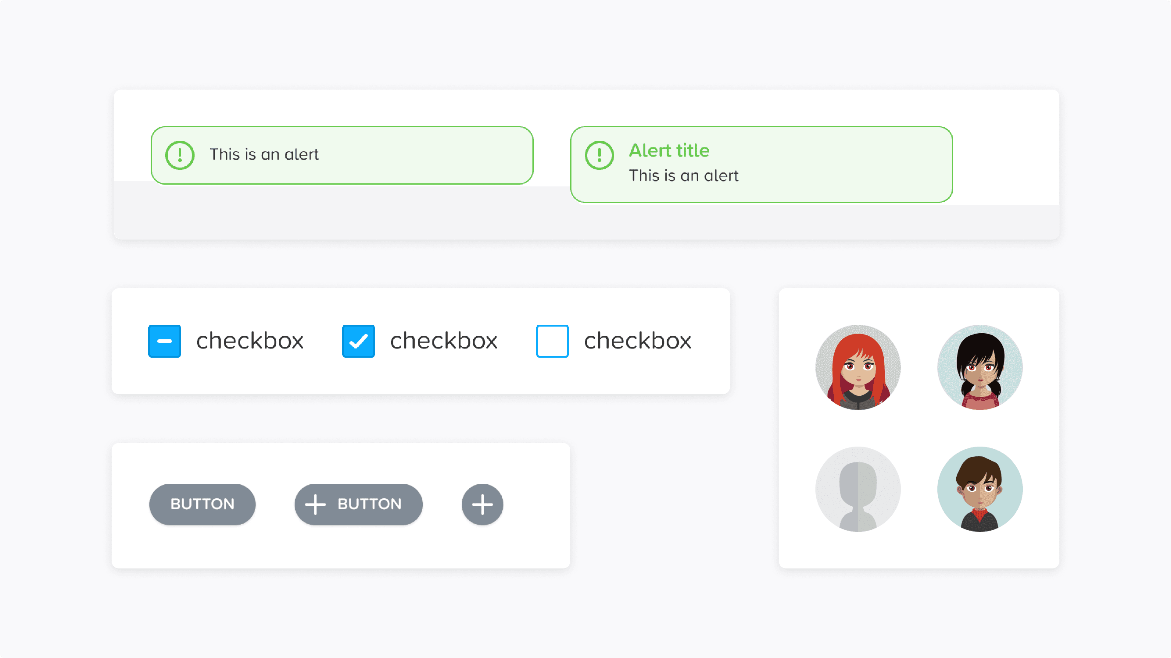
Basic Components
This library was made up of simple components (similar to Molecules or elements in other systems) such as alerts, buttons, input controls and data visualisation including progress bars & rings. These components would often combine with other basic components to form more complex components or patterns used throughout the platform.
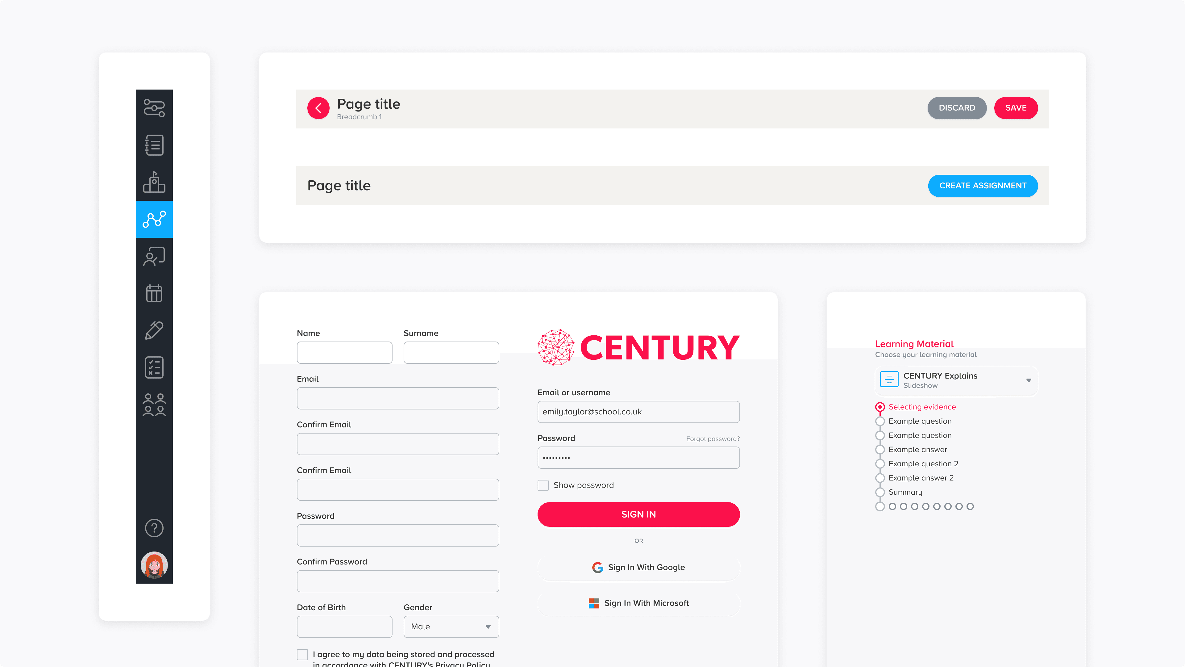
Advanced Components
We decided to split our more complex components into a separate library to keep our files lean and organised. This also aligned with what features Figma had at the time for elements such as cards & widgets. The library contained combinations of basic components such as forms, navigation bars, headers and tables.
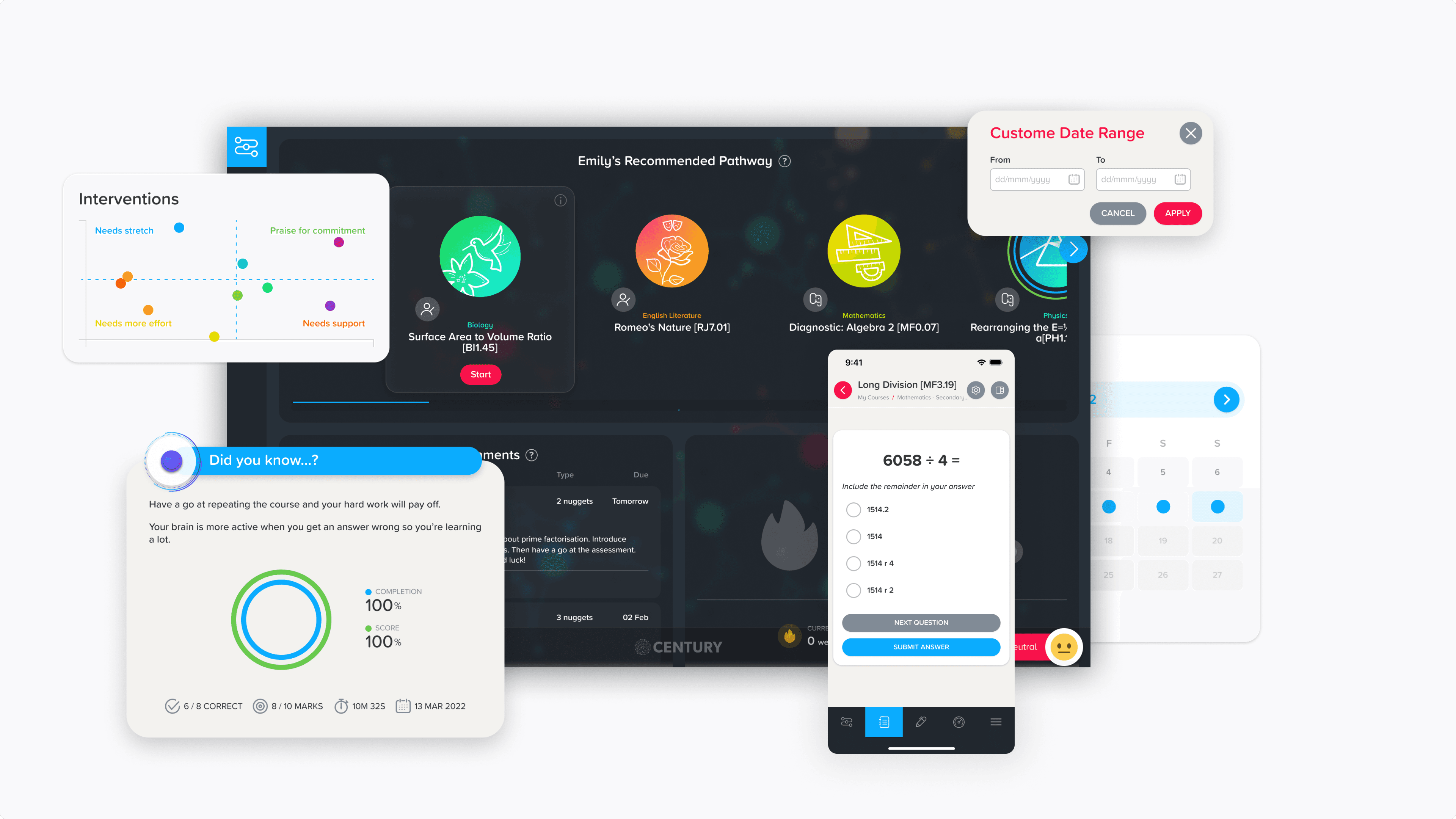
Stories
Our most powerful library - Stories was made up a full defined components such as dialogs, modals & cards. It also included full page templates of every features, from desktop through the mobile. This gave each designer the ultimate library to drop designs in quickly to either present or play around with in their own projects.
The result
I created 4 dynamic Figma libraries that systematically powered each other whilst acting as a single course of truth for designs. The vast range of components available allowed designers to explore and push solutions more quickly whilst the alignment to our development team led to better communication, hand-offs, maintenance and growth.
Foundation
This library acted as the baseline containing the core styles and variables that would be used throughout the other systems, including the likes of; colours, typography, icons, shadows, grids, border radius etc. This gave the team a centralised place to organise and maintain these styles
Basic Components
This library was made up of simple components (similar to Molecules or elements in other systems) such as alerts, buttons, input controls and data visualisation including progress bars & rings. These components would often combine with other basic components to form more complex components or patterns used throughout the platform.
Advanced Components
We decided to split our more complex components into a separate library to keep our files lean and organised. This also aligned with what features Figma had at the time for elements such as cards & widgets. The library contained combinations of basic components such as forms, navigation bars, headers and tables.
Stories
Our most powerful library - Stories was made up a full defined components such as dialogs, modals & cards. It also included full page templates of every features, from desktop through the mobile. This gave each designer the ultimate library to drop designs in quickly to either present or play around with in their own projects.
Post-project
The move to Figma along with the creation of a new design system gave the team a huge boost in their workflow, achieving the goals of improving efficiency and communication. It also gave our team a holistic overview of platform, highlighting key areas we could explore to improve the experience of the product.
Maintaining the system was a job in itself and required time and attention but there was a clear process to follow. I ended up enjoying the challenge of this project and the required organisational and deep thinking skills required.


Want to have a chat?
© Copyright 2023. All rights Reserved.
Made by Jonny Palmer in Framer
Want to have a chat?
© Copyright 2023. All rights Reserved.
Made by Jonny Palmer in Framer
Want to have a chat?
© Copyright 2023. All rights Reserved.
Made by Jonny Palmer in Framer
Want to have a chat?
© Copyright 2023. All rights Reserved.
Made by Jonny Palmer in Framer
The problem
At the time, our design team was using a small UI library in Sketch for any design work which caused the following problems:
Few UI elements meant that designers had to spend a lot of time creating components ad hoc for hi-fidelity designs or hand-offs.
Lack of structure made the library difficult to update, meaning we were often using out of date styles & components
No alignment with the codebase which cause consistency and communication issues with the team & developers
Based on this, we wanted a new design system to empower the team to:
Design with efficiency
Have access to a huge selection of components and styles to quickly & accurately put together designs for exploration or hand-off
Align with development
Use a system that is based off the codebase to create consistency throughout the tech team
Collaborate as a discipline
The system should be easy to adopt and contribute to as a designer, allowing shared responsibility to more opportunity for growth