CENTURY on Mobile
Learn on the go with CENTURY's responsive webapp

CENTURY on Mobile
Learn on the go with CENTURY's responsive webapp
CENTURY on Mobile
Learn on the go with CENTURY's responsive webapp
CENTURY on Mobile
Learn on the go with CENTURY's responsive webapp
This goal of this project was to make our platform respond & perform better to mobile devices, providing a more user-friendly and accessible experience. My role involved redesigning each feature for mobile, undertaking the entire process, from thorough research to the final hand-off.
Company
CENTURY
Duration
3 months
Role
Design Lead
The problem
Initial research suggested that users would be in school using the platform, so it was built to perform primarily on desktop or tablet devices. As more students started to learn outside of school or on the go, we found an increased demand for the web-app to work on mobile devices.
A large number of features on the platform were completely unusable on mobile, providing a poor experience to those trying to learn on their own devices. Based on this, our brief was simple:
How can we improve the user experience and accessibility of CENTURY on mobile?
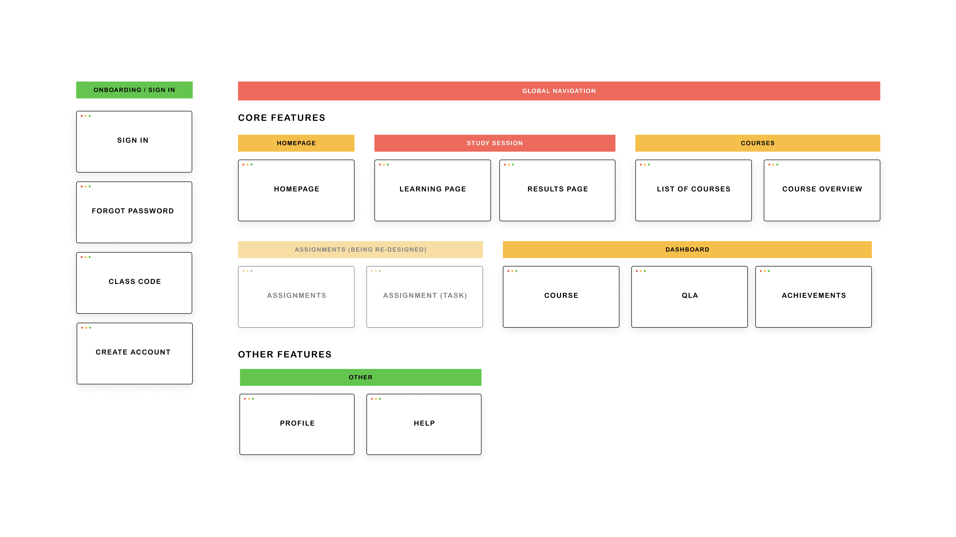
Getting started
My first task was to map out the platform into key flows and features and access how they currently performed on mobile. This allowed me to prioritise the work so that I could focus on the areas that were most important to users / performed poorly on mobile.
Getting started
My first task was to map out the platform into key flows and features and access how they currently performed on mobile. This allowed me to prioritise the work so that I could focus on the areas that were most important to users / performed poorly on mobile.
Getting started
My first task was to map out the platform into key flows and features and access how they currently performed on mobile. This allowed me to prioritise the work so that I could focus on the areas that were most important to users / performed poorly on mobile.
Getting started
My first task was to map out the platform into key flows and features and access how they currently performed on mobile. This allowed me to prioritise the work so that I could focus on the areas that were most important to users / performed poorly on mobile.
Analysing existing issues
For the purpose of this portfolio, I will focus on how I designed our mobile global navigation. The first step was to analyse what usability issues were occurring when trying to interact with it on mobile.
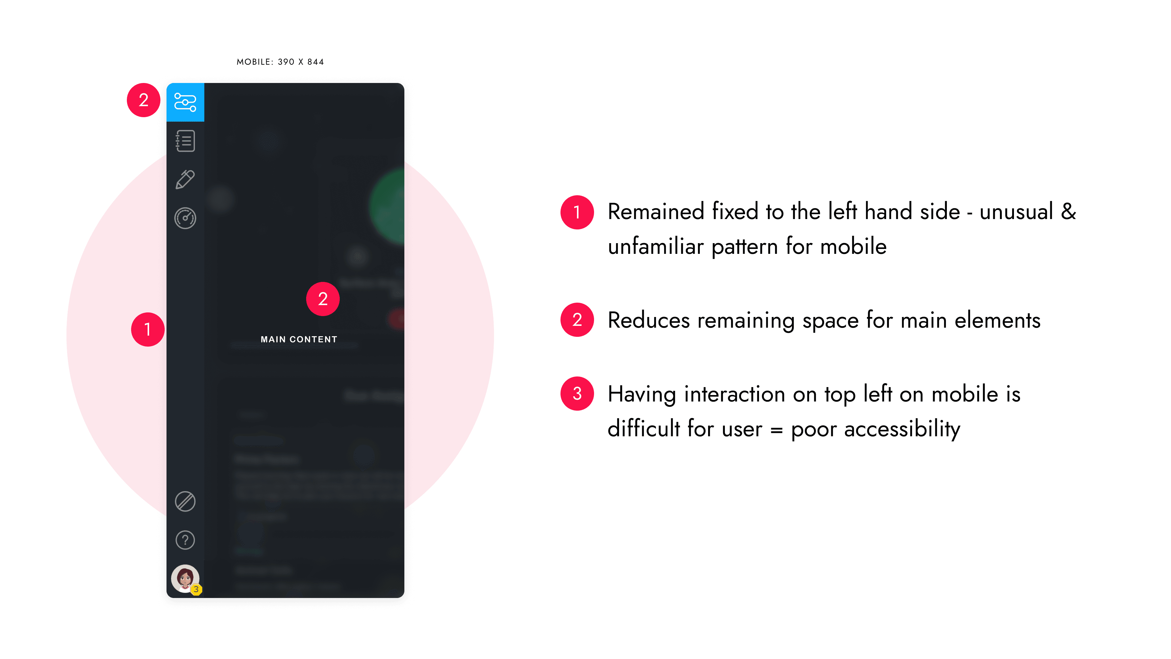
Based on this, I would breakdown what that component allowed users to achieve on desktop and how we needed to ensure they could do the same on mobile;
The menu gave users feedback to see what part of the app they were in at all times
The menu did not affect the main UI or hinder on a users ability to complete a task
They can interact with the menu at any point to navigate to that part of app
The sidebar included all features on the platform, acting as the sole place to navigate.
Analysing existing issues
For the purpose of this portfolio, I will focus on how I designed our mobile global navigation. The first step was to analyse what usability issues were occurring when trying to interact with it on mobile.
Based on this, I would breakdown what that component allowed users to achieve on desktop and how we needed to ensure they could do the same on mobile;
The menu gave users feedback to see what part of the app they were in at all times
The menu did not affect the main UI or hinder on a users ability to complete a task
They can interact with the menu at any point to navigate to that part of app
The sidebar included all features on the platform, acting as the sole place to navigate to and from.
Research
I researched existing solutions that had tackled similar problems to understand what patterns were used and if any research indicated the success of these. One particular example that I felt would work for us was Facebook's hybrid pattern which combined a bottom menu bar with a hamburger to store secondary features.
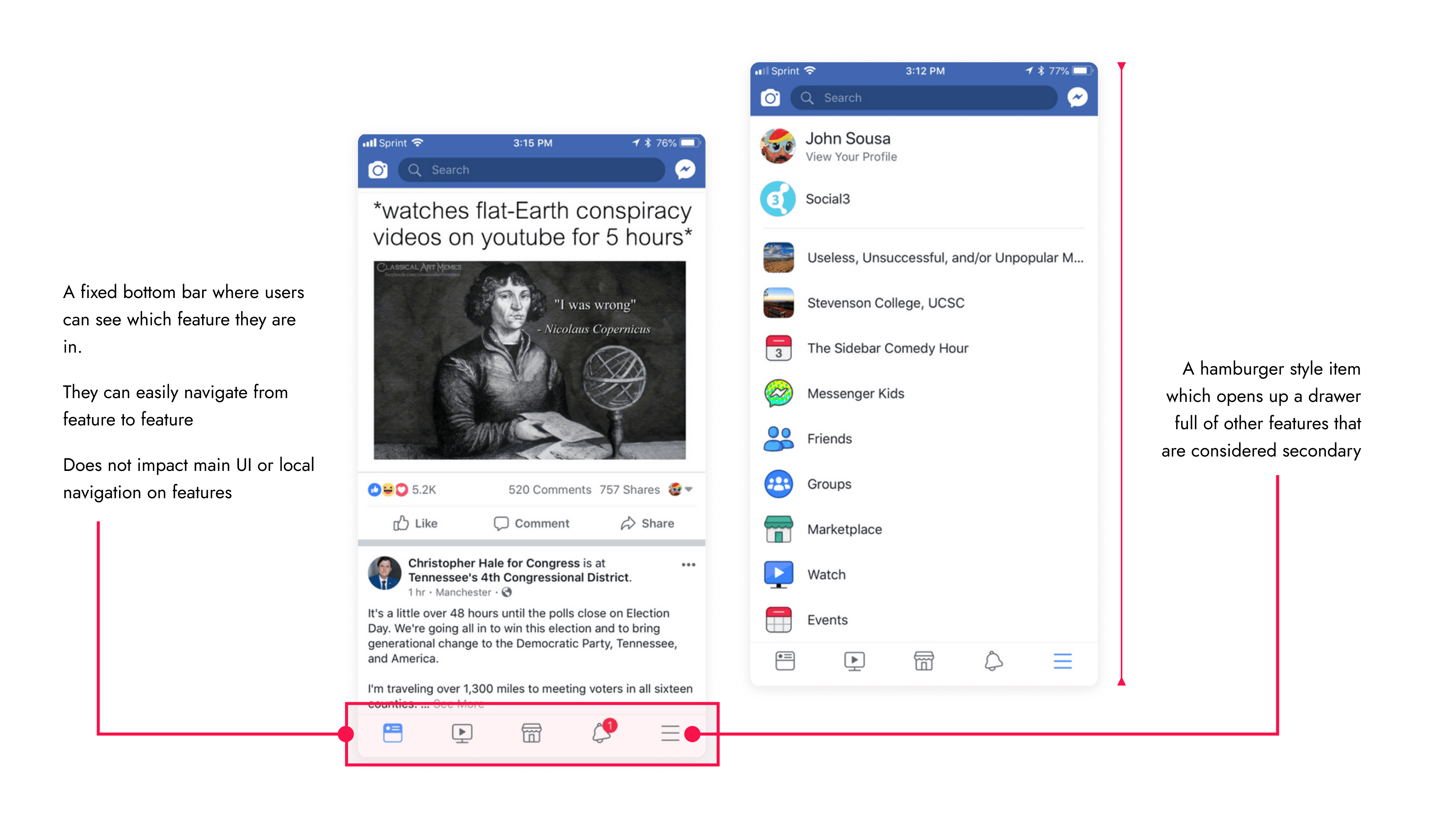
Based on this, I mapped out all the features across our different users and worked with stakeholders to prioritise them based on importance. This gave us an insight into how many items we may need to display via the navigation pattern.

Research
I researched existing solutions that had tackled similar problems to understand what patterns were used and if any research indicated the success of these. One particular example that I felt would work for us was Facebook's hybrid pattern which combined a bottom menu bar with a hamburger to store secondary features.
Based on this, I mapped out all the features across our different users and worked with stakeholders to prioritise them based on importance. This gave us an insight into how many items we may need to display via the navigation pattern.
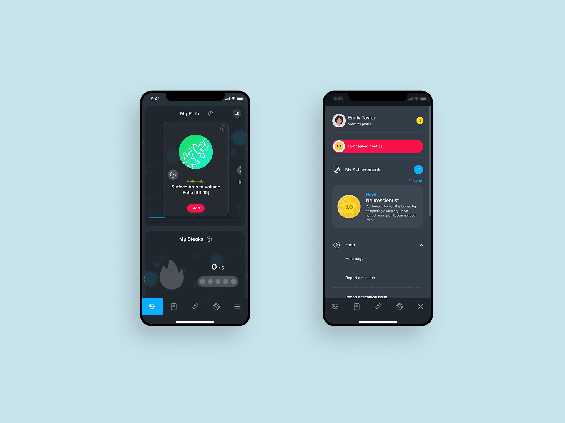
Wireframes & testing
The wireframe process focused on applying the structure above using the hybrid pattern, focusing on functionality. From these, I created simple prototypes to test a) how users interacted with the bottom bar and b) how discoverable were features were in the drawer.

The results validated this as a solution with users completing the tasks easily. These wireframes were turned into hi-fi designs which were shared with stakeholders to review before handing off the specification to developers
Wireframes & testing
The wireframe process focused on applying the structure above using the hybrid pattern, focusing on functionality. From these, I created simple prototypes to test a) how users interacted with the bottom bar and b) how discoverable were features were in the drawer.
The results validated this as a solution with users completing the tasks easily. These wireframes were turned into hi-fi designs which were shared with stakeholders to review before handing off the specification to developers
The result
A dynamic bottom bar which displays the most common features whilst hiding others in a secondary menu. This allows users to easily navigate around the app, without disrupting their experience.
The process above was applied to a number of features to achieve a user-friendly and accessible experience. Below are some other examples:

Study Session
The core feature in the platform - a study session. This is where users would come to view learning material (text, slides or videos) then answer questions. This feature had a lot of functionality to consider when designing, such as navigation, feedback on questions and ability to interact with the learning material. One major but successful change was turning the local navgiation sidebar on the right into a bottom sheet
Result screen
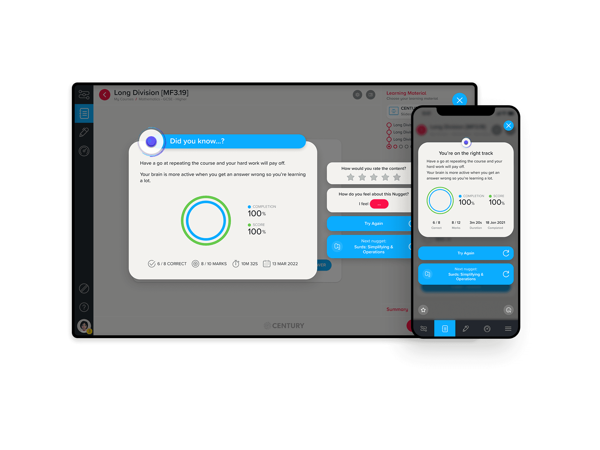
After a user finishes a study session, they are presented with a results screen that includes a lot of information and CTAs. The result led in a stacked layout, with the secondary CTAs being positioned away from the main content. This allowed the user to easily get their results and navigate onwards.
QLA (Dialog)
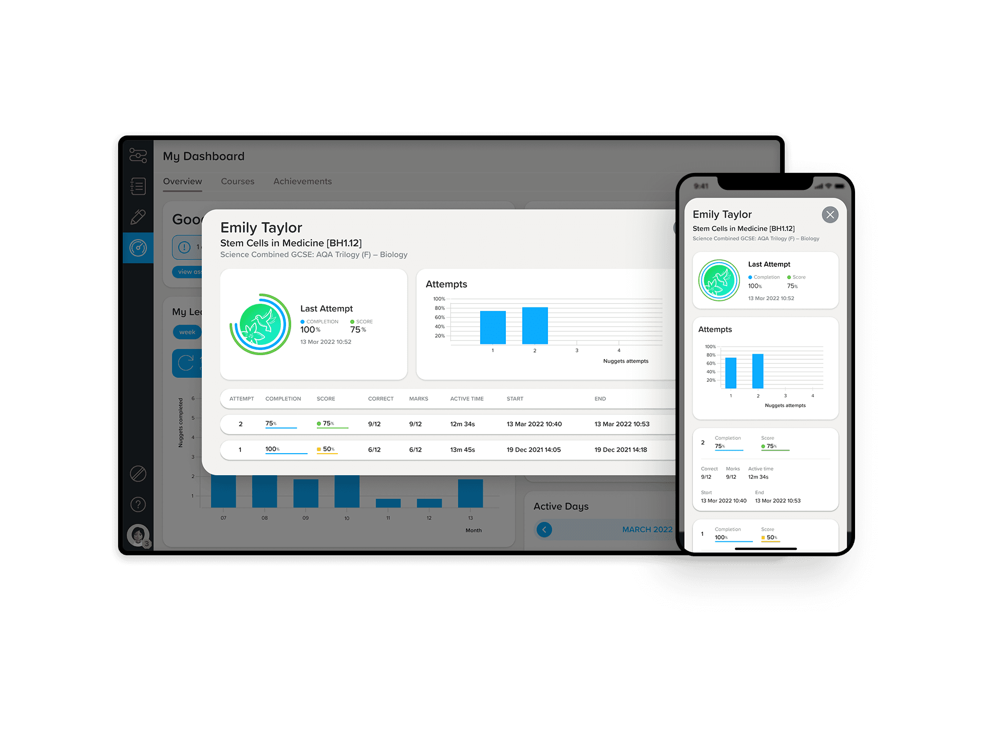
Users who wanted to see a breakdown of their study session could do so through a dialog which contains widgets and a collapsable table. The widgets responded well but the table required an adaptive design. The result ended in turning each row into a card to allow the user to easily view the data in a viewport
The result
A dynamic bottom bar which displays the most common features whilst hiding others in a secondary menu. This allows users to easily navigate around the app, without disrupting their experience.
The process above was applied to a number of features to achieve a user-friendly and accessible experience. Below are some other examples:
Study Session
The core feature in the platform - a study session. This is where users would come to view learning material (text, slides or videos) then answer questions. This feature had a lot of functionality to consider when designing, such as navigation, feedback on questions and ability to interact with the learning material. One major but successful change was turning the local navgiation sidebar on the right into a bottom sheet
Result screen
After a user finishes a study session, they are presented with a results screen that includes a lot of information and CTAs. The result led in a stacked layout, with the secondary CTAs being positioned away from the main content. This allowed the user to easily get their results and navigate onwards.
QLA (Dialog)
Users who wanted to see a breakdown of their study session could do so through a dialog which contains widgets and a collapsable table. The widgets responded well but the table required an adaptive design. The result ended in turning each row into a card to allow the user to easily view the data in a viewport
Post-release
We released our mobile improvements incrementally so that tracking and analysing the impact of each feature was easier. After updating the key features such as navigation, study session, pathway and courses, we saw an increase in mobile users who were successfully completing important tasks such as lessons.


Want to have a chat?
© Copyright 2023. All rights Reserved.
Made by Jonny Palmer in Framer
Want to have a chat?
© Copyright 2023. All rights Reserved.
Made by Jonny Palmer in Framer
Want to have a chat?
© Copyright 2023. All rights Reserved.
Made by Jonny Palmer in Framer
Want to have a chat?
© Copyright 2023. All rights Reserved.
Made by Jonny Palmer in Framer
The problem
Initial research suggested that users would be in school using the platform, so it was built to perform primarily on desktop or tablet devices. As more students started to learn outside of school or on the go, we found an increased demand for the web-app to work on mobile devices.
A large number of features on the platform were completely unusable on mobile, providing a poor experience to those trying to learn on their own devices. Based on this, our brief was simple:
How can we improve the user experience and accessibility of CENTURY on mobile?
The problem
Initial research suggested that users would be in school using the platform, so it was built to perform primarily on desktop or tablet devices. As more students started to learn outside of school or on the go, we found an increased demand for the web-app to work on mobile devices.
A large number of features on the platform were completely unusable on mobile, providing a poor experience to those trying to learn on their own devices. Based on this, our brief was simple: